Family-Owned and Operated since 2000
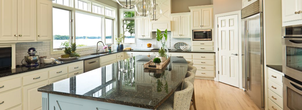
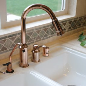
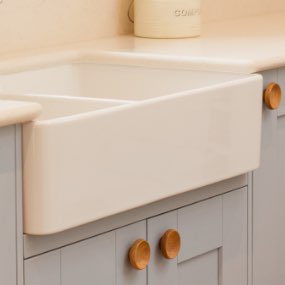
Creative Counters supplies countertops, cabinets, faucets, and other hardware to both homeowners and builders.
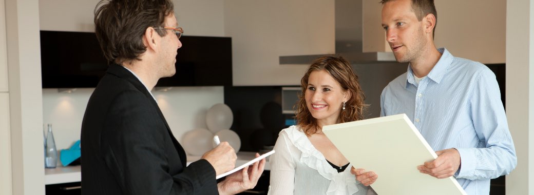
Our first priority is to help you find the right countertops and cabinetry for your kitchen and bath project. You’ll receive personal attention at our fully-stocked showroom where you can view our products and talk with one of our friendly consultants before making a final decision. The Creative Counters team is committed to providing personalized kitchen and bathroom remodeling products to our customers to make their building or remodeling dreams come true.
 Learn More About Us
 Check Our Showroom Hours
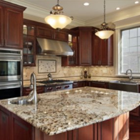
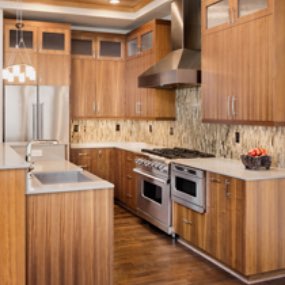
The Products We Offer
A Trusted Member of the West Bend Area Business Community
We are members in good standing of these fine organizations:


Our Showroom Hours
Stop by for a visit and see our products for yourself.
| Mon-Thurs | 10am-4pm |
| Fri | 11am - 2pm |
| Sat-Sun | Closed |