@import url('https://fonts.googleapis.com/css?family=Libre+Franklin:400,400i,700,700i'); input, button, select, textarea, body, .lead, .font-body { &, &.h1, &.h2, &.h3, &.h4, &.h5, &.h6, .h1, .h2, .h3, .h4, .h5, .h6 { font-family: 'Libre Franklin', sans-serif; font-weight: 400; strong, &.bold, .bold { font-weight: 700; } } } h1, h2, h3, h4, h5, h6, .font-heading { &, &.h1, &.h2, &.h3, &.h4, &.h5, &.h6 { font-family: 'Libre Franklin', sans-serif; font-weight: 400; strong, &.bold, .bold { font-weight: 700; } } } /*-------------------------------------------*\ Main Variables \*-------------------------------------------*/ @baseColor: #C8B592; @buttonMain: #645142; @buttonCustom: #C8B592; @line-height-heading: 1.3; @line-height-body: 1.5; @pixelfont: 14px; @h1: 42px; @h2: 36px; @h3: 28px; @h4: 22px; @h5: 18px; @h6: 16px; @lead: 20px; @accent2: #645142; @accent3: #333333; @accent4: #D18100; @accent5: #666666; @accent6: #F2F2F2; /* Do not touch */ @darkColor: #000; @lightColor: #fff; /*-------------------------------------------*\ Helper function \*-------------------------------------------*/ .mixin (@a) when (lightness(@a) >= 66%) { color: @darkColor; } .mixin (@a) when not (lightness(@a) >= 66%) { color: @lightColor; } ::selection { background: @baseColor; } ::-moz-selection { background: @baseColor; } .complementary(@_a){ background-color: @_a; .mixin(@_a); } .btn(@b:@buttonMain){ border-color: @b; .complementary(@b); text-shadow: none; &:hover,.disabled, [disabled] { background-color: darken(@b, 4%); border-color: darken(@b, 4%); .mixin(@b); } &:active, .active, &:focus, .focus { background-color: darken(@b, 8%); border-color: darken(@b, 8%); .mixin(@b); } } .element(@_arg, @font:@_arg) { a:hover, .sidebar-content .nav.nav-tabs.nav-stacked .parent ul a.selected, .sidebar-content .nav li li a:hover, div[role="complementary"] div > ul > li:hover{ color:darken(@font,8%) } a, .nav-tabs > .active > a, .nav-tabs > .active > a:hover, .nav-tabs > .active > a:focus, .nav li a:hover, .nav li a:focus, .navbar .nav > li > a:focus, .navbar .nav > li > a:hover, .pagination ul > li > a:hover, .pagination ul > li > a:focus, .pagination ul > .active > a, .pagination ul > .active > span, nav[role="navigation"] .nav-normal > .active > a, nav[role="navigation"] .nav-normal li a:hover, nav[role="navigation"] .nav-pills-square > .active > a, nav[role="navigation"] .nav-bar > li > a:hover, nav[role="navigation"] .nav-bar > li > a:focus, nav[role="navigation"] .nav-bar > .active > a, nav[role="navigation"] .nav-bar-top > .active > a, nav[role="navigation"] .nav-bar-top > li > a:hover, nav[role="navigation"] .nav-bar-underline > .active > a, nav[role="navigation"] .nav-underline > .active > a, nav[role="navigation"] .nav-underline > li > a:hover, nav[role="navigation"] .nav-separator > .active > a, nav[role="navigation"] .nav-separator > li > a:hover, .sidebar-content .nav a.active, div[role="complementary"] div > ul > li:active, .sidebar-content .nav li a:hover, .sidebar-content .nav li a:focus { color: @font; } .nav a:hover .caret { border-bottom-color: @font; border-top-color: @font; } .nav-tabs > li > a:hover, .nav-tabs > li > a:focus, .navbar .nav > .active > a, .navbar .nav > .active > a:hover, .navbar .nav > .active > a:focus, .nav-pills > .active > a, .nav-pills > .active > a:hover, .nav-pills > .active > a:focus, .nav-tabs.nav-stacked > .active > a, .nav-tabs.nav-stacked > .active > a:hover, .nav-tabs.nav-stacked > .active > a:focus, .nav-list > .active > a, .nav-list > .active > a:hover, .nav-list > .active > a:focus, .grid li a:hover img, textarea:focus, input[type="text"]:focus, input[type="password"]:focus, input[type="datetime"]:focus, input[type="datetime-local"]:focus, input[type="date"]:focus, input[type="month"]:focus, input[type="time"]:focus, input[type="week"]:focus, input[type="number"]:focus, input[type="email"]:focus, input[type="url"]:focus, input[type="search"]:focus, input[type="tel"]:focus, input[type="color"]:focus, .uneditable-input:focus, .gform_wrapper li.gfield_error input[type="text"]:focus, .gform_wrapper li.gfield_error input[type="url"]:focus, .gform_wrapper li.gfield_error input[type="email"]:focus, .gform_wrapper li.gfield_error input[type="tel"]:focus, .gform_wrapper li.gfield_error input[type="number"]:focus, .gform_wrapper li.gfield_error input[type="password"]:focus, .gform_wrapper li.gfield_error textarea:focus { border-color: @_arg; } .navbar .nav > .active > a, .navbar .nav > .active > a:hover, .navbar .nav > .active > a:focus, .nav-pills > .active > a, .nav-pills > .active > a:hover, .nav-pills > .active > a:focus, .nav-tabs.nav-stacked > .active > a, .nav-tabs.nav-stacked > .active > a:hover, .nav-tabs.nav-stacked > .active > a:focus, .nav-list > .active > a, .nav-list > .active > a:hover, .nav-list > .active > a:focus, .dropdown-menu > li > a:hover, .dropdown-menu > li > a:focus, .dropdown-submenu:hover > a, .dropdown-submenu:focus > a, .dropdown-menu > .active > a, .dropdown-menu > .active > a:hover, .dropdown-menu > .active > a:focus, .progress .bar, .progress-striped .bar, .progress-info.progress-striped .bar, .progress-striped .bar-info, nav[role="navigation"] .nav-pills-square li a:hover { background-color: @_arg; } .form-control:focus{ border-color: @_arg; box-shadow: 0 1px 1px rgba(0, 0, 0, 0.075) inset, 0 0 8px rgba(red(@_arg),green(@_arg), blue(@_arg), 0.6); } .pagination > .active > a, .pagination > .active > span, .pagination > .active > a:hover, .pagination > .active > span:hover, .pagination > .active > a:focus, .pagination > .active > span:focus{ background-color: @_arg; border-color: @_arg; } } .home a { text-decoration: none; } .transition(@property: all; @duration: .3s; @function: ease; @delay: 0s) { -moz-transition: @property @duration @function @delay; -o-transition: @property @duration @function @delay; -ms-transition: @property @duration @function @delay; transition: @property @duration @function @delay; } body, p, .gform_body .gfield input, .gform_body .gfield textarea, .gform_body .gfield select { font-size: @pixelfont; line-height: @line-height-body; } h1, h2, h3, h4, h5, h6, .h1, .h2, .h3, .h4, .h5, .h6 { line-height: @line-height-heading; } h1, .h1 { font-size: @h1; } h2, .h2 { font-size: @h2; } h3, .h3 { font-size: @h3; } h4, .h4 { font-size: @h4; } h5, .h5 { font-size: @h5; } h6, .h6 { font-size: @h6; } .lead { font-size: @lead; line-height: @line-height-body; } /* Scrolltotop */ #topcontrol { background-color: rgba(0, 0, 0, 0.1); background-position: center center; background-repeat: no-repeat; -webkit-transition: all 0.2s ease-out; -moz-transition: all 0.2s ease-out; -o-transition: all 0.2s ease-out; -ms-transition: all 0.2s ease-out; transition: all 0.2s ease-out; border-radius: 3px; color: #ffffff; height: 48px; line-height: 55px; margin: 0 15px 15px 0; text-align: center; width: 48px; z-index: 10000; } #scrolltotop:before { border-color: rgba(255, 255, 255, 0) rgba(255, 255, 255, 0) #ffffff; border-image: none; border-style: solid; border-width: 10px; content: ""; height: 0; left: 28%; position: absolute; top: 17%; width: 0; } #topcontrol:hover{ background-color: darken(@baseColor,10%); } /*-------------------------------------------*\ Accent Colors \*-------------------------------------------*/ .accent { color: @baseColor !important; } .accent2 { color: @accent2 !important; } .accent3 { color: @accent3 !important; } .accent4 { color: @accent4 !important; } .accent5 { color: @accent5 !important; } .accent6 { color: @accent6 !important; } /*-------------------------------------------*\ Custom Fonts \*-------------------------------------------*/ .font-custom1 { font-size: 12px; } /*-------------------------------------------*\ Buttons \*-------------------------------------------*/ .element(@baseColor); .btn-primary{ .btn(); border-radius: 0; border: 0; color: #fff; font-size: 18px; font-weight: 700; line-height: 1.555555556; padding: 11px 61px; &:hover,&:active,&:focus { border: 0; background-color: #432505; } } .btn-custom { .btn(@buttonCustom); color: #fff; &:hover,&:active,&:focus { background-color: #D18100; color: #fff; } } /*-------------------------------------------*\ Header \*-------------------------------------------*/ .home .header-shadow { box-shadow: none; } header img.brand { width: 100%; max-width: 266px; } header nav[role="navigation"] > ul:first-child { margin-top: 0; } header nav[role="navigation"] > ul > li { margin: 0 15px; > a { color: @lightColor; font-size: 16px; padding: 10px 0; &.dropdown-toggle .caret { border-bottom-color: @lightColor; border-top-color: @lightColor; } } // + li { // margin-left: 20px; // } &:hover, &:active, &:focus, &.active { > a { color: @accent2; background-color: transparent; &.dropdown-toggle .caret { border-bottom-color: @accent2; border-top-color: @accent2; } } } } .nav li a:hover, .nav li a:focus { color: @accent2; background-color: transparent; border-color: transparent; } nav[role="navigation"] ul > li .dropdown-menu > li:hover > a, nav[role="navigation"] ul > li .dropdown-menu > li > a:hover { background: none repeat scroll 0 0 @baseColor; color: #fff; } .main-nav-phone { background-color: @accent2; color: @lightColor; font-size: 18px; margin-left: 40px; padding: 10px; > i { color: @lightColor !important; } &:hover, &:focus, &:active { color: #fff; background-color: #432505; } } .text-link a { color: #fff; display: block; text-align: center; font-size: 16px; } #header .col > a { display: block; } .text-link { margin-bottom: 10px; margin-left: 40px; } /*-------------------------------------------*\ Hompage CSS \*-------------------------------------------*/ /* Banner */ .hp-banner { .container { padding-top: 495px; } } .hp-banner-box { background-color: @baseColor; box-shadow: 0 3px 6px 0 rgba(0, 0, 0, 0.16); margin-bottom: -30px; padding-top: 10px; } /* Section 2 */ .hp-s2 .container { padding-top: 15px; } .hp-s2-link-boxes { margin-top: 15px; } .hp-s2-link-box { margin-bottom: 40px; margin-left: auto; max-width: 520px; position: relative; width: 100%; .transition(); > span { background-color: rgba(100, 81, 66, .8); bottom: 0; color: @lightColor; display: block; font-size: 18px; font-weight: 700; padding: 15px 20px; pointer-events: none; position: absolute; width: 100%; } i { .transition(); } &:hover { box-shadow: 0 4px 8px 2px rgba(0,0,0,0.2); i { margin-left: 5px; } } } /* Section 3 */ .hp-s3-product { overflow: hidden; // padding: 20px; position: relative; .transition(); &:hover { box-shadow: 0 8px 10px 0 rgb(0, 0, 0, .16); .hp-s3-content { background-color: rgba(100, 81, 66, 1); height: 100%; > p { margin-bottom: 20px; opacity: 1; } } } } .hp-s3-content { position: absolute; display: block; width: 100%; height: 60px; bottom: 0; padding: 8.5px 20px; background-color: rgba(100, 81, 66, .8); .transition(); > p { margin-bottom: 0; opacity: 0; .transition(); } } /* Section 4 */ .hp-s4-logos { > img { width: 100%; max-width: 165px; + img { margin-left: 15px; } } } .hp-s4-content, .hp-s4-showroom-box { padding: 20px 20px 30px; } .hp-s4-showroom-box { background-color: #645142; h2, p { color: #fff; } } .hp-s4-showroom-table { color: #fff; font-weight: 700; font-size: 18px; width: 100%; tr { border-bottom: 1px solid #fff; } td { padding: 10px 0; } td.day { text-align: left; } td.time { text-align: right; } } /*-------------------------------------------*\ Footer \*-------------------------------------------*/ /* CTA Footer Image */ .cta-footer-image { padding-left: 0; padding-right: 0; > .container { padding-left: 0; padding-right: 0; } img { width: 100%; } } .cta-footer { .btn { width: ~'calc(100% - 30px)'; padding: 11px 0; } } /* Main Footer */ .main-footer { .container { padding-top: 70px; } &, h4, span { font-size: 14px; } address { margin-bottom: 0; } [itemprop="name"] { font-weight: 700; } [itemprop="postalCode"] { display: inline-block; margin-bottom: 20px; } a:hover, a:focus, a:active { &, i { color: @baseColor; opacity: 1; } } } .main-footer-title { margin-bottom: 30px; } .main-footer-socials { a + a { margin-left: 25px; } i { color: #fff; font-size: 24px; .transition(); } } .main-footer-line { border-color: @baseColor; margin: 70px 0 0; } /* Bottom Footer */ .bottom-footer { padding-top: 20px; padding-bottom: 20px; font-size: 12px; color: @baseColor; } /*-------------------------------------------*\ Global CSS \*-------------------------------------------*/ /* Sidebar */ //In the future, we will improve to all of cases. div[role="complementary"] .flexnav a.current-page { color: @baseColor !important; /* edit this property for active page */ } /* Well */ .page .well { background-color: #fff; border: 1px solid #ccc; } /* HR line */ hr { border-color: #ccc; } /*-------------------------------------------*\ Media Queries \*-------------------------------------------*/ @media (min-width: 992px) and (max-width: 1199px) { header nav[role="navigation"] .nav > li { margin: 0 10px; > a { font-size: 14px; } } .main-nav-phone { margin-left: 10px; } } @media (max-width: 991px) { h1, .h1 { font-size: 30px; } h2, .h2 { font-size: 28px; } h3, .h3 { font-size: 26px; } .lead { font-size: 18px; } header nav[role="navigation"] { display: none; } .main-nav-phone { margin-left: 0; margin-right: 50px; } .hp-banner .container { padding-top: 265px; } .hp-banner-box { padding-bottom: 5px; } .hp-s2-link-box { margin-right: auto; } .hp-s3-products { -ms-flex-pack: center; -webkit-box-pack: center; -webkit-justify-content: center; justify-content: center; -ms-flex-wrap: wrap; -webkit-flex-wrap: wrap; flex-wrap: wrap; } .hp-s3-product { width: 100%; max-width: 285px; } .hp-s4-logos { -ms-flex-pack: center; -webkit-box-pack: center; -webkit-justify-content: center; justify-content: center; } .main-footer .container { padding-top: 20px; } .main-footer-title { margin-top: 30px; margin-bottom: 15px; } .main-footer-line { margin-top: 40px; } .text-link { margin-left: 0; } } @media (max-width: 767px) { h2, .h2 { font-size: 26px; } h3, .h3 { font-size: 24px; } header img.brand { width: 100%; max-width: 150px; } .btn { padding: 11px 0; width: 100%; max-width: 265px; margin: 0 auto; } .main-nav { position: relative; .container .row { > div + div { position: static; } } } .main-nav-phone { margin: 0; position: absolute; left: 0; right: 0; top: 69px; text-align: center; } .hp-s2 .container { padding-top: 40px; } .hp-s2-link-box > span { font-size: 15px; padding: 10px 10px; } .hp-s4-logos { -ms-flex-direction: column; -webkit-box-orient: vertical; -webkit-box-direction: normal; -webkit-flex-direction: column; flex-direction: column; > img + img { margin-left: 0; } } .cta-footer { .container .row { -ms-flex-direction: column; -webkit-box-orient: vertical; -webkit-box-direction: normal; -webkit-flex-direction: column; flex-direction: column; } } .bottom-footer ul { float: none !important; display: table; margin: 0 auto; } }

Cabinets

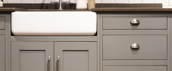
Peak form and function

Choose from our extensive selection or customize your own!

Creative Counters will help you add your personal style and flair to your remodeling or construction project. We have an impressive collection of cabinets at our showroom that you can peruse at your leisure. From the modern and sleek to the classic and sophisticated, we have cabinets for every style and budget.

But if you want complete control over your cabinets, our design experts will give you the guidance you need to fully customize your project. This way, you can match your cabinetry to any countertop or decor. With so much choice, you’ll be able to completely transform your kitchen or bathroom and make your vision a reality.

Cabinets

When you personalize your cabinets with Creative Counters you’ll have control over:

  • Style
  • Material
  • Function
  • Price
  • Holiday Kitchens

Whether you have a dream for customized cabinets in mind or you want to explore your options before making a decision, our showroom experts will empower you to realize your design aspirations.

Countertops

in multiple styles and materials including quartz, solid surface, cultured marble, and natural stone

Read More

Faucets

from all the leading manufacturers like Kohler, Moen, Delta, Blanco, Elkay, and more

Read More

Sinks

that are beautiful and durable, so they’ll add value to your home for years to come

Read More